
What is Data Visualization?
Data Visualization is a way of representing data and information with the help of charts, graphs, etc. It’s a way of showing the information in graphical format, that is easier to understand and perceive. It can be useful due to its visual aspects. Data Visualization is considered important because it makes the complicated information easier to understand. Data visualization makes it possible to gather data from different sources, simplifying it for people.
It explores new patterns and reveals the unnoticed patterns of the data. The key to representing good data visualization is to know in what cases which charts and graphs would be relevant. To do this we need to learn about the types of data visualization and what they represent.
Types of Data Visualization
Data visualization offers different ways of collecting and showing data and information. It can be done through charts, graphs, infographics, maps, and dashboards.
- Graphs and Charts represent the visualization of relations of numerical data. Graphs can have different types, such as line graphs, pie graphs, bar graphs, etc.
- Maps are usually used when representing geographical data. On maps the data connected to air conditioning or the weather is best represented by colors, for instance, the darker the color is the worse the quality of air is.
- Infographics help to represent multiple data features about this or that topic. They can be short and simple or long and profound.
- Dashboards usually include several visual methods such as graphs, charts, etc. Dashboards are helpful when we need to collect and represent visually a lot of information for diverse audiences.
Types of Charts
Charts are a type of data visualization. They can represent the information in different ways based on what kind of chart exactly we are using and what type of data we are representing. Usually, the success of the chart is connected with the information. Different types of charts better represent different data. Thus we need to identify the purpose of the chart and then choose the most relevant type for the data.
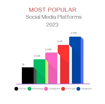
• Bar charts are the most obvious charts to highlight the difference between different categories.
• Column chart is very like the bar chart, it’s again used for comparing different categories. But in certain cases, bar charts are preferable.
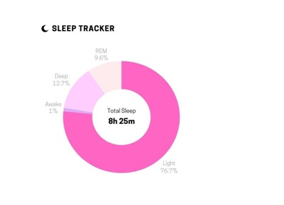
• The pie chart is used to compare the value against the total. Unlike the bar and the column charts, this chart is not used for comparing categories. The unique feature of pie charts is that when we look at the circle our brain compares the categories to the whole, but not the categories to each other.
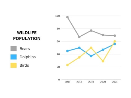
• The line chart is very helpful for showing changes over time. This is very useful when we want to highlight the increases and decreases of certain categories over an exact period of time
Advantages of Data Visualization
Data visualization is a useful method of representing the information and any data simply and making it visually easier to perceive. The advantages of data visualization are:
• Enhanced Understanding: Data visualization helps users better understand complex data by presenting it in a visual format. It enables users to perceive features, trends, and relationships that may not be obvious in data. By transforming data into visual representations like charts, graphs, and maps, individuals can quickly grasp key insights and make more decisions based on more information.
• Clear Communication: Visualizations aid in the effective communication of data-driven findings. They provide a common ground for discussions and make it easier to share information among different stakeholders. Visual representations are often more engaging and memorable than raw data by making it easier to convey important messages and gain consensus.
• Quick Data Analysis: Data visualization simplifies the analysis process. Instead of sifting through countless rows and columns of data, users can extract meaningful information at a glance. Interactive visualizations allow for drilling down, filtering, and exploring specific aspects of the data, enabling users to conduct analysis and gain deeper insights rapidly.
• Better Decision-Making: Visualizing data empowers decision-makers to make more informed and data-driven choices. By presenting data visually, decision-makers can assess the impact of different variables, identify outliers, and evaluate the consequences of various scenarios. This enhances the quality of decision-making and reduces the risk of errors caused by relying on an incomplete understanding of the data.
• Efficient Data Exploration: Data visualization enables users to explore vast data efficiently. Interactive visual tools provide a flexible environment to manipulate and interact with data, allowing users to uncover hidden patterns or trends easily. By visually navigating through data, users can make discoveries and generate new insights that might have otherwise gone unnoticed.
Businesses looking to seamlessly incorporate charts into their strategies can leverage the flexibility and ease of use offered by tools like the WordPress chart plugin, streamlining the process of creating impactful visualizations for effective decision-making.
Disadvantages of Data Visualization
Data visualization is a quite powerful tool that helps individuals and organizations make sense of complex information by representing it visually. It allows for the exploration, analysis, and communication of data in an intuitive and accessible format. However, like any tool, data visualization also has its limitations and disadvantages that should be taken into account. Some of the disadvantages of data visualization include:
● Oversimplification: While data visualization aims to present complex data in a simplified manner, there is a risk of oversimplifying the information. By condensing data into charts, graphs, or diagrams, some nuances and details may be lost, leading to a superficial understanding of the underlying data. Certain datasets and relationships are inherently complex, and trying to simplify them too much through visualization can lead to misleading interpretations.
● Subjectivity and Bias: Data visualization requires a human decision-making process to determine which data to display, how to encode it, and which visual representation to use. These decisions can be influenced by personal biases, assumptions, or preconceptions of the data analyst or designer. Each choice made during the visualization process introduces a subjective element, which can affect the objectivity and accuracy of the representation. It is important to be aware of potential biases and strive for transparency and fairness when creating visualizations.
● Misinterpretation: Even well-designed visualizations can be misinterpreted or misunderstood by the viewers. People with limited knowledge or experience in data analysis may struggle to correctly interpret the displayed data. The presence of outliers, varying scales, or subtle labeling differences can all contribute to misinterpretations. It is crucial to provide proper context, clear explanations, and sufficient information alongside visualizations to mitigate these risks.
● Data Overload: While data visualization aims to simplify complex information, it can also overwhelm users with excessive amounts of data. When presented with too much information or too many visual elements, viewers may have difficulty identifying patterns or drawing meaningful insights from the visualizations. Cluttered or crowded visualizations can lead to a cognitive overload, inhibiting effective data comprehension and decision-making.
Why You Should Add Charts to Your Business Strategy?
In today’s data-driven business landscape, incorporating charts into your business strategy is a powerful way to unlock insights, communicate complex information effectively, and make informed decisions. These visual representations provide clarity, improve understanding, and allow for better analysis and interpretation of data. Here are several compelling reasons why you should consider adding charts to your business strategy:
● Simplify complex data: Businesses generate massive amounts of data from various sources. Charts provide a simplified visual representation that condenses and organizes complex information into easily digestible formats. By converting raw data into charts, you can identify patterns, trends, correlations, and outliers more efficiently.
● Enhance data analysis: Charts enable you to analyze data more effectively by highlighting key metrics, comparing variables, and identifying relationships. Whether you need to assess sales performance, track market trends, or evaluate customer behavior, charts provide a comprehensive overview at a glance. Visual representations give you a deeper understanding of your data, helping you make data-driven decisions with confidence.
● Facilitate communication and collaboration: Charts serve as a universal language that can be easily understood by different stakeholders within your organization. Whether you’re presenting data in meetings, sharing reports, or collaborating on projects, charts simplify information sharing and encourage the development of the process of meaningful discussions. Visualizing data fosters clear and efficient communication, allowing team members to align their perspectives and work towards mutual goals.
● Engage stakeholders effectively: Charts are visually appealing and have the potential to captivate your audience’s attention. Whether you’re presenting to executives, investors, or clients, charts can effectively convey your message and support your arguments. They provide a concise and impactful way to present insights, making your presentations more engaging and persuasive.
● Identify trends and patterns: Visualizing data through charts helps identify trends and patterns that might be challenging to notice in raw data. By plotting data points on line charts, bar graphs, or scatterplots, you can reveal upward trends that are downward, seasonal variations, or sudden changes. These insights allow you to adjust your business strategy accordingly, seize opportunities, or mitigate potential risks.
In conclusion, data visualization is an extremely powerful tool that helps to visualize datasets through charts, graphs, maps, and other data visualization tools. Data visualization helps for a better understanding of complicated raw data, it simplifies and represents data in more obvious ways. Thus, data visualization, especially charts, is very important for business strategy, it engages different stakeholders and serves as a universal language. Makes the presentation more powerful and convincing.